Instructions
Before You Start Editing
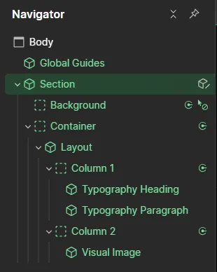
This template is built with the Lumos framework — no custom code. But it does use a few smart techniques that make editing faster once you know them. Here's what you'll see, and how to use it. Takes 2 minutes to read.
1. Global Guides (Column Overlay)
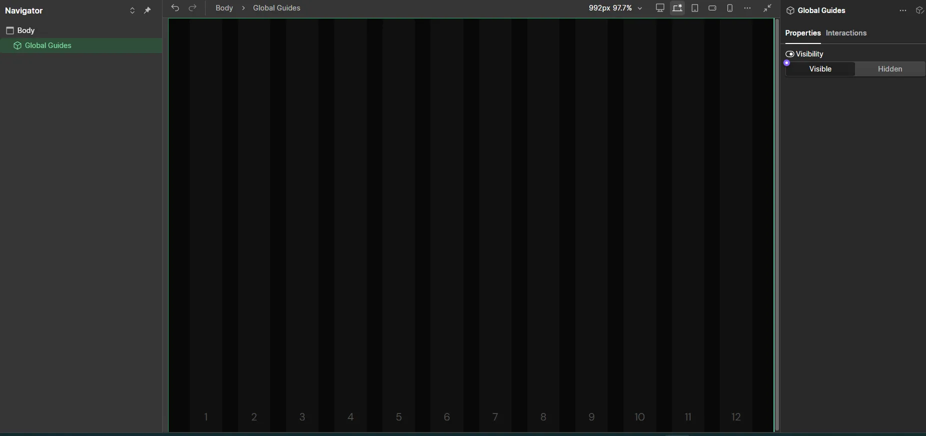
Global Guides is a hidden 12-column grid overlay — like layout guides in Figma. Turn it on to see exactly which columns each element spans, so your edits line up perfectly.
How to use it: Find Global Guides in the Navigator (top of the page tree). Open its Settings panel and switch Visibility to Visible. Switch it back to Hidden when you're done — it's only a guide, not part of the live design.
2. Variable Modes
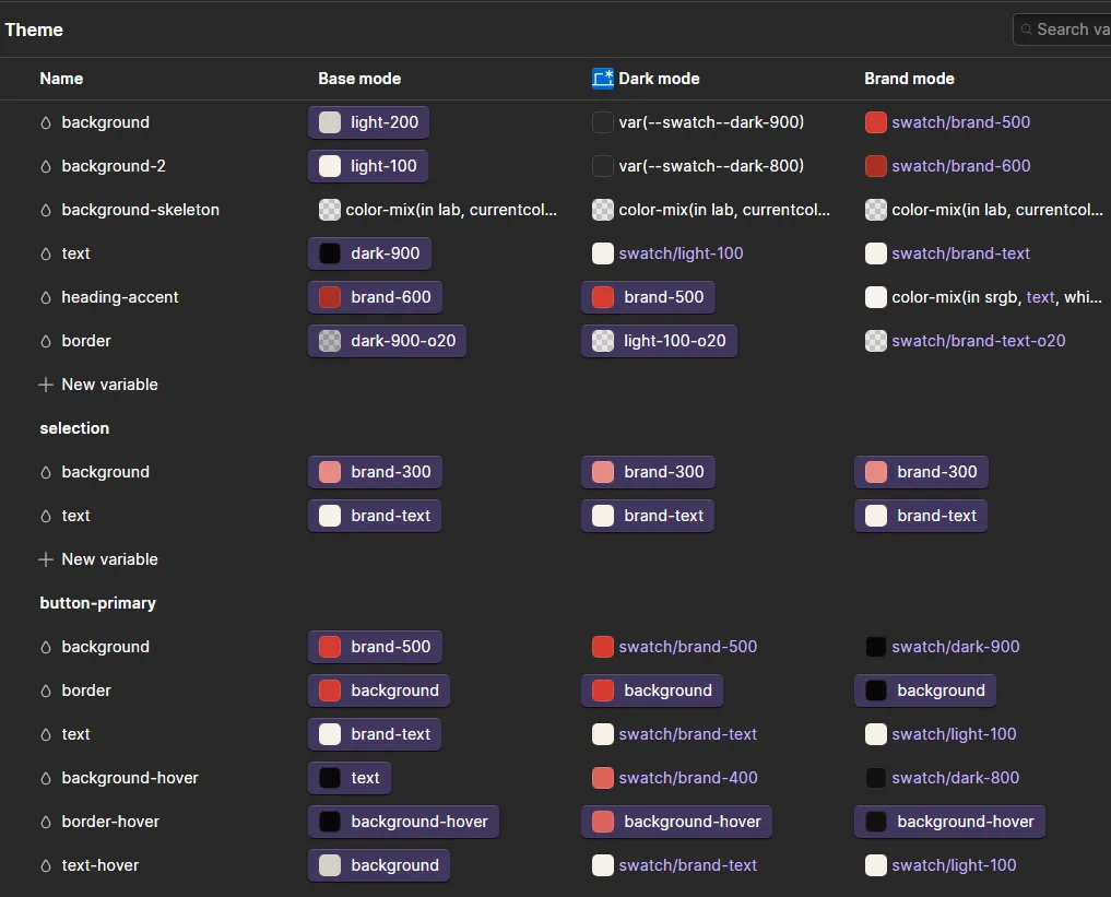
Some settings have multiple "modes" — like Dark / Light / Brand for color themes, or a different size for each heading level. Switch the mode instead of manually restyling each one.
3. Responsive Variables (Large, Medium, Small & XSmall Modes)
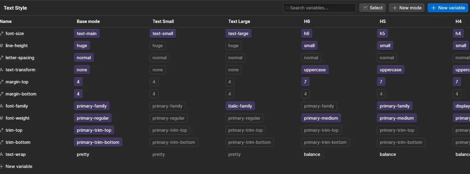
Some settings have multiple "modes" — like Dark / Light / Brand for color themes, or a different size for each heading level. Switch the mode instead of manually restyling each one.
Padding Example
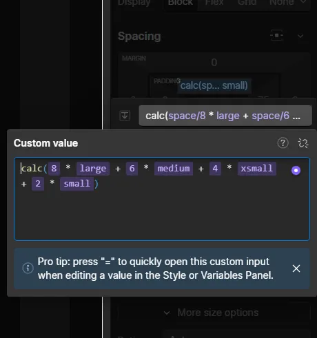
This template doesn't resize "automatically" by magic — every value is written once using four modes: Large, Medium, Small, and XSmall. Each mode holds its own value of 1 at their respective container sizes / breakpoints & switches to 0 on other breakpoints, so the design adjusts as the screen gets smaller or larger.
Padding example: A section's padding might be 8rem on Large, 6rem on Medium, 4rem on Small, and 2rem on XSmall — one formula covers all four.
Display Example
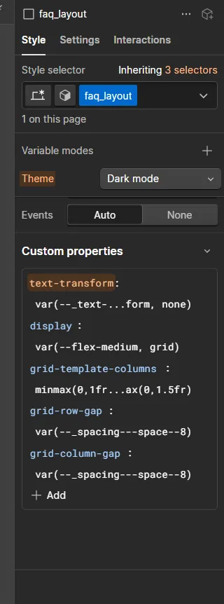
Display example: A layout might be Grid on Large/Medium, then switch to Flex (stacked) on Small/XSmall — again, one formula, one place to edit.
4. Fluid Builder App (Text & Spacing Sizes)
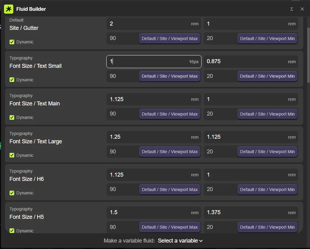
Text and spacing sizes use a formula, not a plain number, so they scale smoothly between screen sizes instead of jumping. This was set up with the Fluid Builder app.
To resize something: Open Fluid Builder from the Apps panel, find the variable (e.g., Font Size / Text Small), and change the two rem numbers — one for Large screens, one for Small screens. The app blends between them automatically. Don't edit the formula by hand in the Style panel.
5. Hover & Active Effects
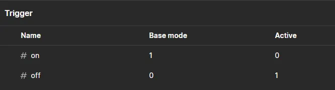
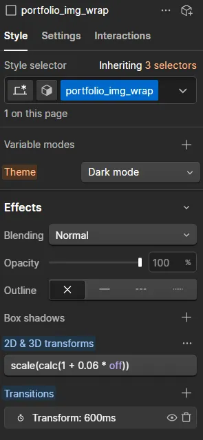
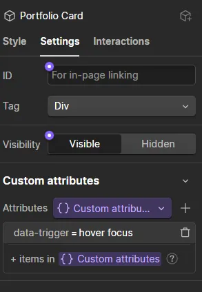
Hover animations and "active" states (like the current nav link) aren't Webflow's built-in Hover state — they're powered by small custom attributes: data-trigger and data-state & variable modes (State & Trigger System).
Hover example: A button might have data-trigger="hover" — hovering over it smoothly scales image (child) up or shifts its color.
Active example: A nav link might have data-state="current" — it highlights automatically when you're on that page, no manual styling needed.
Don't delete these attributes — removing them turns off the animation, but won't break the layout.
6. Prebuild Sections with Layout Variants
NOTE: This Page Is Fully Built with Section, Layout & Element Components Only. Take This as a Referance.
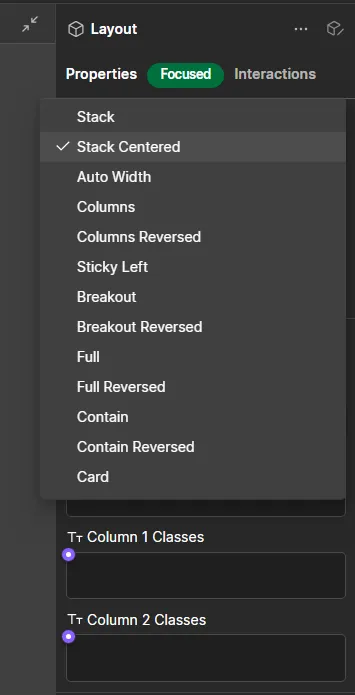
Each section is built from three parts: a Section component , Layout & a element components inside it. The Layout component has Variants — like Stack Centered, Columns, Sticky Left, Breakout, Full, or Card — that control how the section is arranged.
To change how a section looks: select the Layout element and pick a different Variant from the dropdown — the content rearranges automatically.
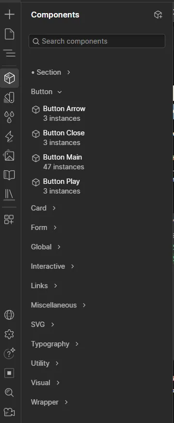
Inside each Layout, you'll find our prebuilt components (headings, paragraphs, images, etc.) — find more of these anytime in the Components panel on the left sidebar. Don't unlink or detach these components; editing works fine while they stay connected.